

Website Mistakes That Are Quietly Killing Your Conversions
A website conversion mistake is any design, copy, or UX choice that stops a visitor from taking action. This post covers the six most common ones costing small business owners real leads right now, plus a checklist to audit your own site before spending another cent on traffic.
Most websites look fine. That’s the problem.
Your homepage is live. The logo is in the right place. The contact page exists. You showed it to a few people and they said it looked good. So why isn’t anyone calling?
We audited a site for a client spending $3,000 a month on Google Ads. Plenty of clicks. Almost no enquiries. They came to us asking about a redesign. We ran a conversion audit first. The landing page had no headline above the fold, just a full-width photo of their office. The CTA was a phone number buried in the footer. The contact form had nine fields. We changed three things. Conversions went up before the redesign was even started. Same ad spend. Different results.
Nine times out of ten, it’s not the design. It’s a handful of very fixable mistakes quietly pushing visitors out the door before they decide to trust you. Here’s what we keep finding.
TL;DR: Most small business websites lose leads not because of bad design, but because of a buried CTA, a weak headline, a long form, a broken mobile experience, hidden social proof, and a slow load time. All of these are fixable without a full rebuild.

Your Call to Action Is Buried, or Missing Entirely
A website without a clear call to action is a shop with no till. Visitors arrive, look around, and leave because there was nothing obvious to do next.
“Contact us” sitting near the footer is not a call to action. It’s a formality.
A real CTA tells the visitor exactly what to do and why it’s worth doing right now. “Book a free 15-minute audit” converts better than “get in touch” every single time. And it needs to be visible before anyone scrolls, not tucked below three paragraphs about your business history. Fix this before you touch anything else on the page.

Your Headline Doesn’t Actually Say Anything
The headline does 80% of the work on any page. Most visitors never read past it. If it doesn’t immediately tell them what they get and why it matters to them, the rest of the page is irrelevant.
“Welcome to [Business Name]” is a greeting, not a headline. Greetings don’t convert.
A strong headline names the result the customer actually wants. Specific beats clever. Plain English beats jargon. And it should be the first thing someone reads when they land on your page, not a subheading they find after scrolling past a stock photo of someone shaking hands.
Your Contact Form Is Asking Too Much
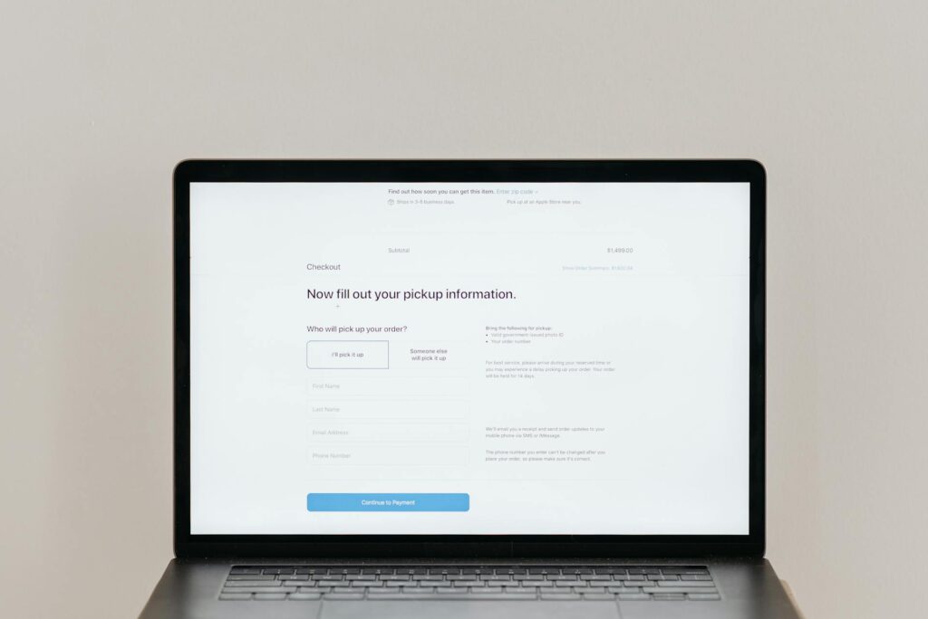
Every extra field in a contact form is a small moment of friction. Add enough of them and the visitor quietly closes the tab.
We changed a form from seven fields to two, first name and email. Downloads on that offer tripled in the first week. Same page, same traffic, same offer. Different form.
The limit: name, email, and one specific question. That’s it. You can get everything else on the call. Most leads don’t convert because the form was too long, not because they weren’t interested.
- Name
- One specific question (e.g. “What’s the main thing you want to fix?”)

Mobile Is Still an Afterthought
More than half of all web traffic is on mobile. On most small business sites we audit, the mobile experience is technically functional, in the way a folding chair is technically furniture.
The font is small. The button is hard to tap. The form fields are too tight to type in comfortably. Nobody designed this for a thumb.
If your mobile site is doing the bare minimum, you are losing visitors who arrived ready to enquire. Not sometimes. Regularly. And nobody is calling to tell you.
Social Proof Is Buried Where Nobody Sees It
A specific testimonial above the fold converts better than five generic ones at the bottom. We’ve seen this pattern on nearly every site we audit.
Visitors need to trust you before they scroll, not after. If your only reviews are in the footer, most people will leave before they ever reach them.
Move one strong, result-specific testimonial high on the page. Not “great service, very professional.” That’s filler. “We had 12 new bookings in the first two weeks” is trust. These are very different things.
The Page Loads Slowly and Nobody Told You
A one-second delay in page load time can drop conversions by around 7%. Nobody calls to tell you the site is slow. They just leave, and your analytics logs a bounce.
Run your site through Google PageSpeed Insights right now. If you score below 70 on mobile, that is a real problem, and in most cases it’s fixable without a full rebuild.

Quick Checklist: Audit Your Site Before Spending on Ads
Before investing in more traffic or a full redesign, run through these six checks. If you answer no to two or more, you have a conversion problem, not a traffic problem.
- Is there a clear CTA visible above the fold?
- Does the headline say what the customer gets, not who you are?
- Does the contact form have three fields or fewer?
- Does the mobile version feel easy to use on a phone?
- Is at least one specific testimonial visible before scrolling?
- Does the site score above 70 on Google PageSpeed (mobile)?
FAQ
How do I know if my website has a conversion problem?
If you have traffic coming in but few enquiries or sales, that’s the tell. A healthy conversion rate for a small business website is typically between 2% and 5%. Below 1% means visitors are arriving and leaving without doing anything. Run through the checklist above. If you’re failing more than two of those, start there before spending anything on ads.
What is the most common website mistake small businesses make?
A missing or buried call to action. Most small business sites have some version of “contact us” hidden near the bottom of the page, but no clear, specific prompt above the fold telling visitors what to do next. That one fix, moving a strong CTA to the top of the page, is the highest-return change you can make without touching anything else.
Do I need a full website redesign to fix my conversion rate?
Probably not. Most conversion problems are copy and UX issues, not design problems. A better headline, a shorter form, a testimonial moved above the fold, and a visible CTA can dramatically change results without rebuilding the site. We always run a conversion audit before recommending a redesign. Nine times out of ten, the redesign is the last thing needed.
How many fields should my contact form have?
Three, maximum. Name, email, and one specific question. Every field you add after that reduces the chance of someone completing it. If you need more information before a call, ask for it during the call, not on the form. The goal of the form is to get the conversation started, not to qualify the lead before you’ve spoken to them.
Most small businesses don’t have a digital marketing budget problem. They have a website that leaks visitors at every stage. A 1% improvement in conversion rate on 1,000 monthly visitors is 10 extra enquiries a month. Doubling your ad spend gets you the same result for double the cost. Fixing the website is almost always the smarter move first.
Not sure where your site is losing people?
We run free 30-minute conversion audits. No pitch, no commitment. We’ll show you exactly what we’d fix and why.